


FOREST IQ
BRAND IDENTITY
BACKGROUND
—
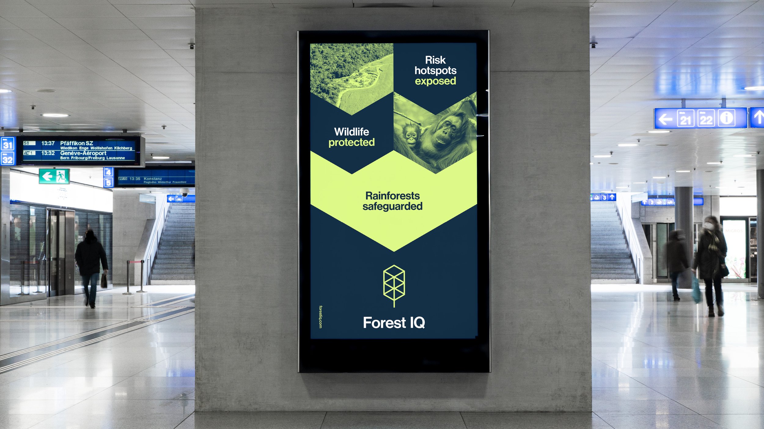
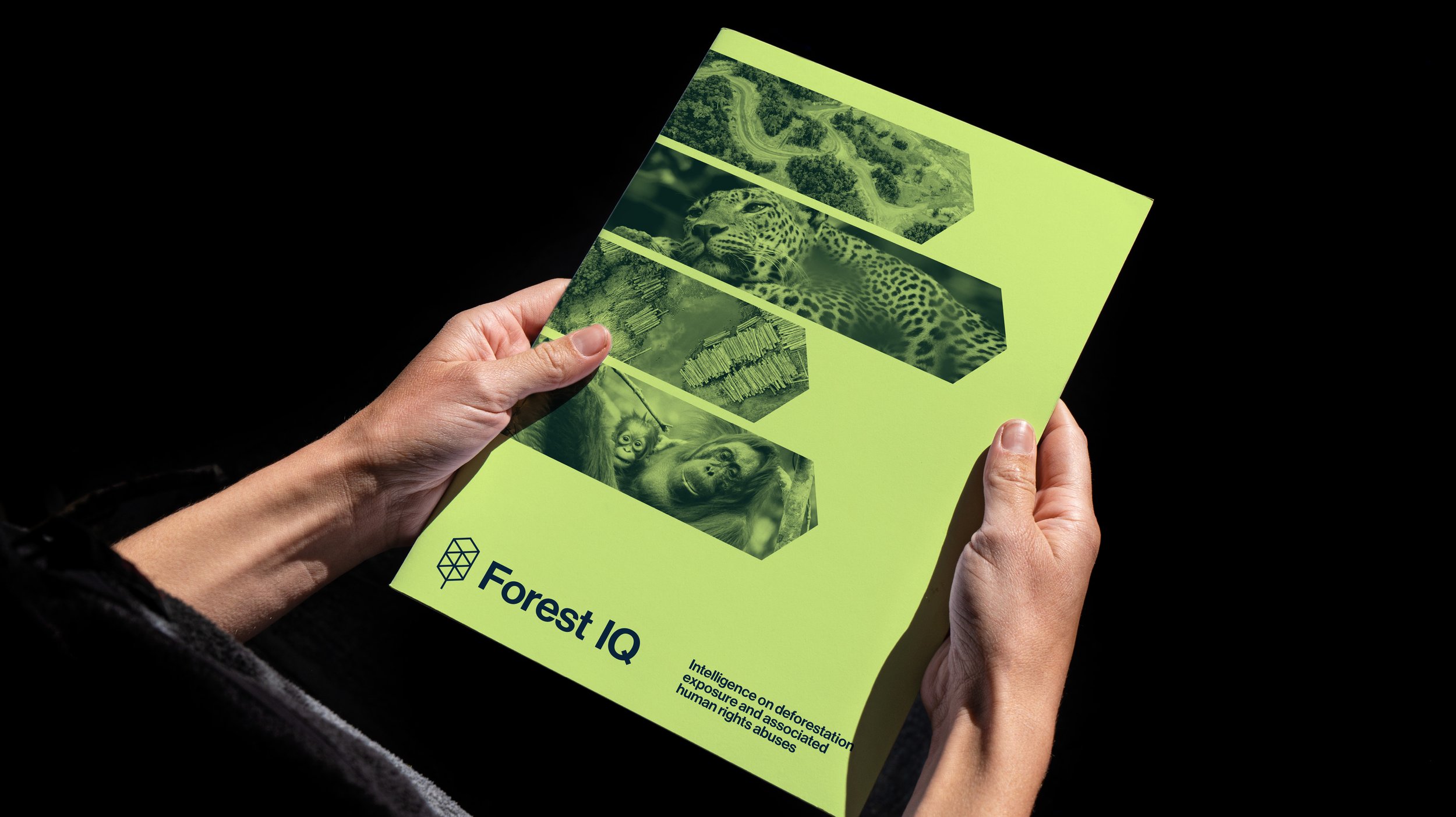
Forest IQ provides financial institutions with comparable data and metrics across those sectors in their portfolios that may have exposure to deforestation, conversion of natural ecosystems and associated human rights abuses. This enables them to compare companies on their deforestation exposure, materiality and commitments and performance, and make decisions accordingly.
This enables financial institutions to identify risks and opportunities to help them to deliver deforestation-free portfolios.
SOLUTION
—
Our task was to position Forest IQ as something that felt more at home in the technology and finance world rather than the NGO sector. Avoiding earthy colours and cliché environmental charity graphic language was fundamental in this feeling appropriate to where it will exist in a more corporate sector.
The Forest IQ symbol represents data storage whilst also being an abstraction of that which it is at its core, concerned with protecting. Trees.
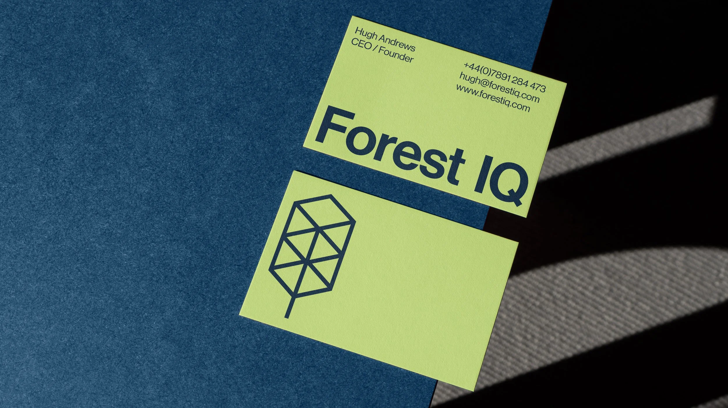
The visual identity expands on the shape of the symbol and uses it in a range of ways to build a bespoke graphic language, sometimes as simple as a frame for an icon or image and in other instances to graphically depict supply chains through simple vector shapes.
The colour palette is a balance of a vibrant, energetic lime/yellow for immediacy and urgency whilst being grounded in a more sober, professional deep blue.